As a user experience design specialist, clients often ask Jeff Patton to make their software "look better," so it can be successful. But when clients focus primarily on aesthetics, they're often addressing the wrong thing. In this column, Jeff takes a look at common user interface (UI) mistakes and the key concerns software development teams should address to build successful UIs.
This is a short column about beauty. I have a sub-specialty in user experience design. Most people interpret this to mean that I help make their software look better. But the sad truth is that I usually can't because many of the products I come in contact with are ugly at their core. They aren't accomplishing what users need, so no amount of making the products pretty will make them a success. There's an old expression that "beauty is but skin deep" and a contemporary addendum that "ugly goes clean to the bone." In software, this is an uncomfortable truth.
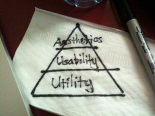
After explaining to people that I can't easily improve their software, they usually look at me with a sad face, not quite knowing what to ask next. That's when I usually reach for a napkin or Post-it note and draw the model in figure 1, a simple pyramid that describes the dependency of concerns I see in software UI.
 |
At the bottom, the foundation is utility. People reach for software in order to solve a problem or help them do something they couldn't easily do without it. If I reach for the software and it has functionality that helps me reach my goal, that's utility.
Above utility is usability. If the product can help me reach my goal, my next concerns are: how easy it is to learn, how efficient it is to use regularly, or how easy it is to remember how to use when I haven't used it for a while. All those concerns and a few more roll up into the product's usability. I can assess usability on anything, but really I only care about the usability of the specific utility I need.
At the tip of the pyramid is aesthetics. If the product looks good doing its job, if it uses appealing color schemes, cool animations, and sexy graphics, then it has strong aesthetic appeal. If it looks sexy but is hard to use, that's a problem. If it looks sexy and does nothing I need, then that's even worse.
When software publishers tangle up these concerns, they start running into problems. But by understanding and tackling them, they have the opportunity to build successful user interfaces that often delight their users.
Start by Focusing on Utility
The Segway is a pretty cool product. It's easy to use (for most people), looks nice, and launched on the market with great fanfare. But, what would you use it for? Really, what would you use it for? Segway's trying to convince us it's great for commuting to work or getting around town. But, it's missing the storage I need for stuff and space for passengers. A bicycle already satisfies my needs for short trips. For me, and lots of people like me, it's not offering the utility that solves a problem. As a result, people won't use it. No amount of aesthetics or usable product features will change that.
To be successful, some products know what their users want to accomplish, and support it in a way that's easy for them to do. Craigslist is a great example. Users love the site because it focuses all of its resources on helping users accomplish what they want. The site makes its users happy despite what some might consider poor aesthetics. And none of the users left the site because of an "ugly design." Craigslist's users love the site because it focuses on the utility.
Usable Product Features: Giving Your Users Only What They Need
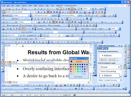
All too often, I encounter software that includes all of the potential features users could want. Most often, teams include all of these features when they're not really sure what users are trying to accomplish with the product. When a product serves a large and diverse audience, software often leaves it to the users to figure out how to solve their problems. The problem is that this feature pollution is typically detrimental to the software's usability.
For example, in my hotel room, I have a television remote for the TV, a funky cable box, and a DVD player. There are dozens of buttons in a variety of sizes ranging from small to really, really small and all the same color. I can't turn the volume down on the TV without studying it for a bit. Picture me trying to turn the volume down as fast as I can because there's no chance of me finding the "mute" button. The utility is there, but not much else.
To satisfy everyone, it's common to want to throw in many features (see figure 2). However, adding features without focusing on the users' goals will often lead to usability and learnability challenges. Teams might do better to create specialized versions of the product targeted at different audiences.
 |
Wow, that's a lot of features! |
In contrast, the Flip video camcorder focuses primarily on the product's usability. The Flip contains only a small subset of features for the users. It has only one button for recording and stopping a video recording. A flip-out USB port connects it with your computer where the software does the rest of the work to copy, edit, combine, and share videos.
With a small feature set, Flip does an excellent job of focusing on what is most important to their audience. For people who just want to shoot movies quickly, keep them, or share them, it's exactly what they need in a usable and aesthetically pleasing package. If you want to do more, it's not for you. Unlike with the Segway, there are enough people out there who want simplicity, so much that the Flip captured a double-digit share of the camcorder market in its first year. The Lipsticked Pig: The Problem of Focusing on Aesthetics First
Many products don't offer the set of features users need to really help them. Sometimes they do, but figuring out how to use the features can be a real pain. Some products with missing utility and questionable usability try to ease the pain by investing in cool visual design. I won't name names here, but we know they're just lipsticking the pig.
I use a Windows-based product to scan expense receipts and prepare expense reports. While not perfect, the product does its job.
Recently I switched to a Mac computer and purchased the Mac version of the same product. Since the "aesthetic bar" seems to have been raised by Apple, I find the Mac versions of Windows products seem to be trying a bit too hard to reach aesthetic parity. The publishers of my receipt-scanning product warned that the Mac version didn't yet have all the features of the Windows version, but it did have a sexy and intuitive user interface. After a couple hours of frustration, I grabbed my old Windows notebook to use the old version of the product. I simply couldn't figure out how to use this new, sexy Mac version to finish my regular routine of scanning a couple weeks of receipts and preparing expense reports. But it certainly looked good not doing what I needed, and it does sync with my iPhone—although I'm not sure exactly what I'd want to sync with my iPhone.
How to Make Your Software a Success: Looking beyond the Beauty
When people ask how I can help make their software look better, I'm pretty sure that's not all they're looking for. The expression that best applies here is "beauty is in they eye of the beholder." My first set of questions to them are, "Who is using your software, and why? How does the product help them?" By starting with these questions, teams can focus on the most important components of their software and begin moving up the pyramid. When you're looking to improve your software, I recommend you look beneath the surface level aesthetics and assess the utility and usability of your product.

