Effective reporting of test results is one of the holy grails of our profession. If done correctly, it improves the project’s quality and helps us focus on the real issues. But if done badly, it adds confusion and reduces the value that testers bring.
Reporting the results of functional tests is relatively simple because these tests have a clear pass or fail outcome. Reporting the results of performance testing is much more nuanced.
Let’s start with a definition: For the purpose of this article, I use the term performance test to mean any test that performs a measurement, with a range of numeric values all considered an acceptable result. It may be measurement of power consumption, the number of users a website serves in parallel, the speed that data can be read from a disk, etc.—any measurement of a nonfunctional requirement.
The first challenge in performance testing is deciding what’s considered a “pass.” Frequently this is neglected in the requirements definition phase. I have seen many requirements that read something like, “Data extraction time from the database shall be less than 10 mSec,” or “The rate of processing a video file shall be at least 100 frames per seconds (fps).” Such requirements are incomplete, as they do not include the actual target we want to hit. We only know the worst result we agree to tolerate and still approve the product. There are two problems here.
First, let’s assume I ran a test and found that video file processing is done at a rate of 101 fps (recall that the requirement was “at least 100 fps”). Looks good, right? But does it mean we are close to the edge (that is, the product hardly meets the requirement) or that everything is fine? If the requirement had been well defined, it would have included both the target and the minimum—for example, target: 120 fps; minimum: 100 fps. With such a requirement, a result of 101 fps clearly indicates the product hardly meets the requirements.
Second, when a test fails marginally (e.g., 99 fps), the product manager is under pressure to be “flexible“ and accept the product as is. How often have we heard, “Indeed, we are below the minimum, but we are almost passing, so we can decide it’s fine”? If the full requirement were available (target: 120 fps), it would be clear how far the results are from the target and that the product has a real issue.
For the sake of completeness, I will mention that a nonfunctional requirement must not only specify target and minimum, but also the test method, since the test method influences the results. For example, when measuring CPU utilization, the results would vary significantly depending on how we perform the measurement. Do we measure the maximum value recorded? Over how long a time? Do we average measurements? How many measurements a second? What else is running on the CPU in parallel to our test?
In theory, reporting performance test results should not be a problem at all. Just present the results and indicate a pass or fail. But again, we don’t only want to know the result; we want to get an idea of how the result relates to the target. Crafting a report that is not overly complex but still delivers a complete picture of the status is a balancing act.
We could use a table:

However, because most products have many performance requirements, we will end up with a large table full of numbers. It will be hard to quickly see where there is a problem. We could use color to improve readability:

But this brings up more questions. Does it make sense that frame processing speed and CPU utilization get the same color code? One is almost failing, while the other is well within the acceptable range. So maybe color frame processing in red? But then what color would we use for a failure? And how long would we consider a result green before it should become yellow? Not to mention the difficulties that could occur due to some people having color-blindness.
I was thinking about this issue when my doctor sent me for my annual blood check, which I do meticulously—about every three years. Anyway, the results from the lab included a list of dozens of numbers displayed in this format:

Even though I am not a physician, I could tell right away which results were fine, which were marginal, and which were something I should discuss with my doctor.
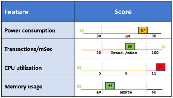
A light bulb went on in my head: Why not use this method for reporting performance tests? I took a few data points and experimented with PowerPoint:

Note that I still use colors, but the axis explains the choice of color and identifies where higher is better and where lower is better in a color-independent way. The reader can clearly see the position of each measurement within the allowed range; the colors serve mainly to focus attention where there is trouble. Creating such a report takes some time, but it could be automated.
I have not yet seen this idea implemented in a real project—I’m still working on that—but if you do use this idea, I’d be happy to learn about your experience and the reaction from your organization.


User Comments
good article, only one recommendation, don't mix minimum and maximum in one column, this is very confusing. Now it looks that having a lower CPU utilization is bad??
... I rest my case!
Reporting performance results in a table is confusing and ineffective in passing the message you want to convey. Sometime the "minimum" is the lowest value you will tolerate (e.g. traffic throughput) and sometimes it's a maximum value (max power consumption). When these are reported together in a table it generates confusion.
My proposal solves these problems.
Thanks for the comment!
Michael