To help product owners and teams create new products, Roman Pichler has developed a new tool called the product canvas. The canvas has grown out of his work with product owners and product managers over the past ten years, and it's designed to be compatible with the business model canvas.
The product backlog is a handy tool that lists the outstanding work necessary to develop a product. However, it can be insufficient when you need to create a brand new product or an update aimed at a new market. The product backlog’s linear structure makes it difficult to capture all product aspects, including the user interface design and the user interaction. There is no place to state assumptions about the target group, the users and customers, and their needs.
To help product owners and teams create new products, I have developed a new tool called the product canvas. The canvas has grown out of my work with product owners and product managers over the last ten years, and it's designed to be compatible with the business model canvas.
A Sample Canvas
The product canvas displays the key pieces of information necessary to create a new product. As its name suggests, it paints a holistic picture of the product.

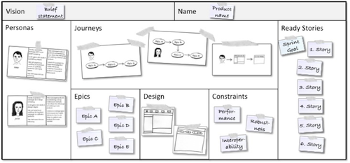
Figure 1. A Sample Product Canvas
The above canvas contains the following: a brief vision statement; the product name; the personas characterising the target users and customers with their needs; epics that describe the product’s functionality; design sketches that capture the product or user interface design; user journey diagrams that illustrate how users are likely to interact with the product; and constraints that express generic operational qualities such as performance.
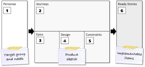
The canvas is designed so that the information flows from left to right starting with the personas. This puts the user at the center of the development effort, and it ensures that you develop a product that is beneficial and desirable.

Figure 2. Stocking the Product Canvas
The journeys, epics, sketches, and constraints sketch the future product, and the ready stories ensure that there are implementable items.
Learning and Emergence
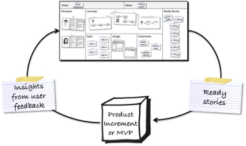
The biggest challenge when developing a new product or a major update is dealing with uncertainty and lack of knowledge. We may not know, for instance, if there is enough demand for the new product or how to meet the user needs successfully The product canvas is therefore designed as a learning tool: to sketch our initial ideas, to get enough stories ready to build software, and to adapt and refine the canvas based on the insights gained. Figure 3 illustrates this cycle.

Figure 3. The Product Canvas as a Learning Tool
Consequently, you should expect your canvas to change as you learn more about the users and customer, and how to best address their needs. It’s common to deal with bigger changes involving clearing out and refilling one or more canvas sections including the section on personas. These changes indicate that the initial product strategy was inappropriate and has to be adapted. Such a change is also called pivot.
The Canvas Sections Explained
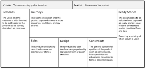
As you have probably noticed, the product canvas combines form and function, a structure together with specific techniques. Figure 4 provides an overview of how the eight canvas sections should be used and I describe the sections in more detail below.

Figure 4. The Canvas Sections Explained
Vision states the intention or motivation behind the product. Keep the vision statement short and sweet. Limit it to one or two sentences.
Product name states the name of the product.
Personas describe the target group using fictional users and customers, including the goals to be met and the problem to be solved. This section explains who we believe is likely to use and purchase the product and why.
Journeys allow you to capture complex interactions of the user with the product. Scenarios, workflow diagrams, story boards are great to illustrate how a user is likely to employ the product. Focus on the important interactions, concentrate on your primary persona, and don’t be shy to update or replace the diagrams as your understanding changes and you explore new aspects of your product.
Epics are coarse-grained, big user stories that sketch the product’s functionality. Every epic must serve a persona or be required by the business model, for instance, displaying online ads. You can connect the epics to the personas by using the persona names in narrative: As <persona name>, I want to <use functionality> so that <need or problem of the persona is addressed>. It’s usually not necessary to order the epics.
Don’t make the mistake of listing all of the product functions you can possibly think of. Rather focus on the epics that are essential to address the user needs. Exposing product increments to users and customers will test your assumptions and ideas and you are likely to discover new epics. The development team should size the epics if you want to track the project progress via a burndown chart.
Design sketches communicate your design ideas. The sketches should capture the critical aspects of the product or user interface design; for instance, the design of a few important screens. I prefer to work with paper sketches, as they are usually good enough to communicate the important design aspects. They are also quick and easy to create and update.
Resist the temptation to create the entire design upfront. The design should evolve based on the feedback you receive from users, customers, and other stakeholders. This helps you design a product with a great user experience.
Constraints describe operational qualities that apply to the entire product. These include performance, interoperability, robustness, and regulatory requirements. The constraints influence the user experience, drive architecture and the technology decisions, and impact the total cost of ownership together with the product’s life expectancy. Unlike the epics and the design sketches, you should clearly describe the constraints upfront. For example, for a performance constraint, state the type of data being transferred, the number of concurrent transactions taking place, and the system configuration used.This facilitates the right architecture decisions, and it ensures testability.
Ready stories are small, detailed stories that feed the next cycle. They are derived from the epics and satisfy the sprint goal when Scrum is used. The ready stories have to be clear, feasible, and testable so that the development team can transform them into a product increment or minimal viable product (MVP).
Order the ready stories from one to n—for instance, first, second, third, and so on—to maximise the chances that you acquire the desired knowledge and to guide the development work. The team should estimate the ready stories if velocity-based iteration planning is employed or if a burndown chart is used to track the project progress.
The Business Model
The product canvas describes the target group and the product features, but not the business model including revenue sources and cost structure. While I have intentionally kept the canvas focused, I have designed it to be compatible with the Alexander Osterwalder’s and Yves Pigneur’s business model canvas. I recommend you use the two canvases together, as Figure 5 illustrates.
Figure 5. Product Canvas and Business Model Canvas
There is a small overlap between the two canvases as both consider the market and the value proposition. But I don’t find this an issue: I use the business model canvas to capture the market and value proposition at a high-level, and I state the details for one specific product on the product canvas.
If you don’t want to employ two separate canvases, you can add the relevant business model canvas sections to your product canvas. However, you need to ensure that the resulting canvas is still easy to understand and update.
Physical Versus Electronic
I prefer to work with a physical product canvas that is placed on the office wall, as this has three main benefits: First, it ensures that the relevant information is visible to the product owner and the team. Second, working with simple, yet effective tools such as paper cards and paper sheets facilitates collaboration. Third, having to work with limited wall space creates focus rather than trying to capture everything that might be relevant. You can, of course, take a picture of the product canvas and post it on your wiki, or replicate the canvas in an electronic tool, like a spreadsheet, if you have to work in a distributed set-up.
Summary
The product canvas brings together the key pieces of information necessary to create a new product: the users and customers with their needs; the product’s functionality and design; and the user interaction. It's intended to be a collaborative tool that helps you capture your ideas and assumptions, test them, and integrate the insights you gain.

User Comments
Very good article. Unfortunately, Figure 5 is missing